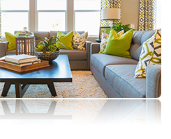
 The way you place furniture in a room can make all the difference in the world. Placement can either make a space feel open and inviting or cramped and off balance. Easily fix furniture faux pas with these arranging tips, and create a space that's design-show worthy.
 Flow high and low. The flow of a room has more to do with movement of the eye than the body. Maintain a clear view across the room especially towards the windows. Keep items low in the center and high around the perimeter. High-backed chairs and floor lamps, for example, can reduce the feel of space when placed in the natural line of sight.
The 3-foot rule. Paths between and around furniture will feel less restricted when kept at around 3 feet. Keep in mind, too, that curved and oval pieces are easier to navigate around than square ones.
Avoid the wall. Pulling furniture towards the center of the room dramatically increases the flow. But if you don't have the square footage for the "3-foot rule" between walls and sofas, 12 inches will do. Add some art to the wall behind and enjoy the new open feel.
Love thy lighting. Overhead lighting is fine for tasks, but in the evening it can be harsh and unpleasant. Secondary lighting from table or floor lamps is essential for defining seating areas and reading nooks.
Chair affair. If you have lots of accent chairs but no one sitting in them, you probably have too much seating. Create extra room and occasional seating with double-duty pieces like an over-sized ottoman that can act as a coffee table when you don't have as many guests.
Get in balance. Placing large or heavy pieces right next to slender or minimal pieces can feel off kilter. Maintain a more balanced feel by grouping items of similar "visual weight" together.
Test these tips in your living areas and feel the flow!
Sources: Apartment Therapy, Bob Vila and YOU Magazine Sept 2017
No comments:
Post a Comment